Infographique Oooh-La-La!
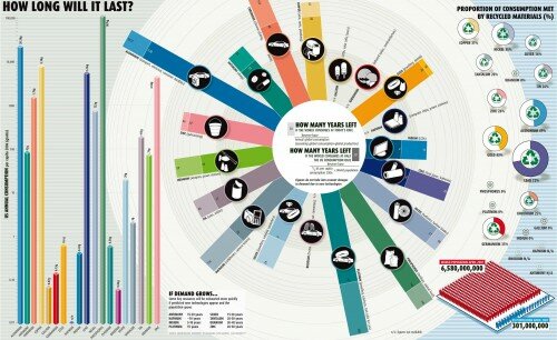
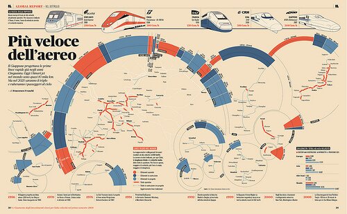
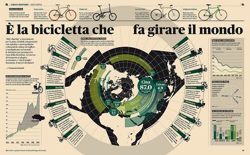

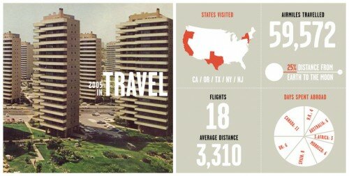
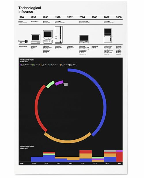
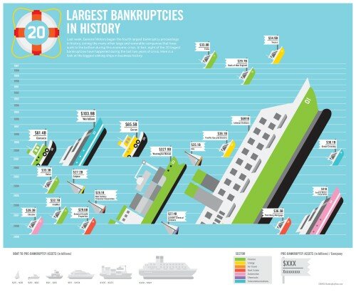
You’ve got to admit, while most design seen in everyday life is very pretty and looks nice and all, there is a disproportionately small amount of exposure being lent to infographics, more commonly referred to as data visualization– visual representations of large amounts data, able to transform what might be a page-long abstract or hundreds of pages of spreadsheet data into a single graphic that can be interpreted just as easily by a layman as a client or stakeholder. I was first exposed to this form of design, among many others, while working at Electronic Ink. I’ve grown to really love and respect the power of the infographic; all too often, nuances in data, sometimes even the most important findings can be overlooked if not presented in the right fashion. Above are some of my favorites, but as they’ve been collected over time, and from bookmarking sites, I can’t link the source. Either way, there’s no denying these designs are infinitely more valuable than the majority of what gets bookmarked on sites like FFFFOUND!
5 Responses to “Infographique Oooh-La-La!”
Trackback URL












on 04 Jul 2009 at 1:59 pm # shelby
love all of these pieces–travel & web trends are my fav.
Good find!
on 10 Jul 2009 at 10:38 am # james
Who are these by? I recognize Nicholas Feltron’s work. Nice post.
on 10 Jul 2009 at 1:25 pm #
Yeah Feltron’s stuff is iconic, I can’t believe that the image above is from his 2005 report, he is really making some great infographic imagery. In fact I was going to do a post on his Hard Times project ( http://feltron.com/index.php?/content/hard_times/P9/ )…maybe I’ll have to do that soon.
As for the others, I’m really not quite sure, often on the sites I’d find these on, the links were broken or not from the original source. For example, the two graphics toward the top in Italian blow me away, I wish I knew what they were saying, or the context in which they appeared. Those images were part of the inspiration for the Wayfarer’s Edition flyer I did a few months ago. ( )
Thanks for reading by the way!
on 20 Jul 2009 at 9:57 am # Brian
I managed to track down the source of the Italian infographics. They appear to be the work of Francesco Franchi. Fantastic stuff.
on 20 Jul 2009 at 10:56 am #
Great find Brian! Thanks for sharing, I’ll have to do a Round 2 with more picks, there are tons of great infographics floating around right now…
PS nice blog dude