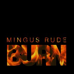
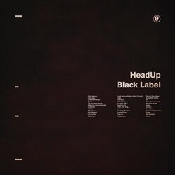
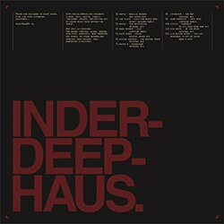
Typcut #0001: Droit

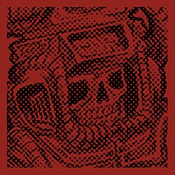
Hope everyone had a fun time for Independence Day this past weekend! I finally broke the unseasonal flu that really took me out of the game all of last week and went to a rooftop party in Philadelphia’s Northern Liberties neighborhood. Anyone who knows anything about Philly and its being the birthplace of the United States must also know how big a party July 4th is in this town, fireworks are not just a show, but an all-night display around the entire city, where things just kind of turn into one gigantic block party. Before I left the house, however, I was finally able to break out of a creative trough I had been in for a couple weeks, with the above– my first submission to Typcut, a just-for-fun type-focused design collective created by Erik Finsrud.
The piece, titled simply “Droit,” is an attempt at a modernist exhibition poster, but with a tongue-in-cheek joke making up the content. Droit de cuissage refers to an alleged right of medieval lords to take the virginity of any girls living on his estate. I first became aware of this misogynistic practice in the film Braveheart, where it was referred to as Ius Primae Noctis. I couldn’t even imagine what it must have been like to live under such conditions, much less how I would have ever stood for such a thing, it almost seemed funny to me. Reading further into it whilst I was reading about all the rampant inaccuracies of the story of William Wallace as depicted Braveheart, I discovered the alternative French pronunciations of the term, droit de seigneur, or the more preferred droit de cuissage or droit de jambage. Droit de cuissage just felt like it rolled off the tongue accurately– sort of elegant and proper, yet filthy and corrupted its core.
The color scheme came to me pretty naturally, as did the urge to incorporate a setting sun composed of lines proportionally diminishing in size. The idea really began to solidify on the morning of July 4th, however, as the goofy pun at the very bottom sort of came to mind, and made me want to incorporate some sort of medieval depiction of one of these lords, the result is a woodcut of one of these guys with a really spoiled, expectant, lordly expression on his face.
Finally, I get a lot of feedback regarding my use of texture in my graphic work. This is a matter of personal preference and style choice, I get a lot of enjoyment out of seeing images that were not created using a computer (preferably before such a medium became so commonplace) and were instead scanned in, and so where I’m able to, I like to make it look like the image was scanned in. This is achieved using a number of separate factors– ensuring no edges of shapes, text, etc. look too sharp or are in perfect alignment at a 90-degree angle perpendicular to the edges of your screen. This, I have found, came prove to be even more crucial than use of texture, although I think texture is also an important factor. It’s important to make sure the textures don’t appear overdone, or artificial, they tell just as much of a fictional story about where the piece has been as the subject matter itself. I often use several different layers, sometimes more than 10, each only at around 5% opacity, and with different layer blending modes in Ps, like Overlay, Soft Light, Multiply, etc. Each mode has its own application as a component within a texture. It requires a measure of experimentation and an abundance of patience, in fact I still refuse to think I have this technique down-pat just yet, but I am pretty happy with the result.
3 Responses to “Typcut #0001: Droit”
Trackback URL

on 06 Jul 2009 at 5:21 pm # Troilus and Cressida (opera) » France Minister of Finance vs. John Stewart on Daily Show!
[…] Typcut #0001: Droit | Blog.H34 : Music, Design, Culture […]
on 06 Jul 2009 at 8:54 pm # Shelby
Dig the Texture. Definitely one my favorites.
on 13 Jul 2009 at 12:31 pm # Daniel Carvalho
As I noted on Scott’s blog, well done. It’s great to see your work evolving and maturing over time. You should get your portfolio up and running so we can see more, and make a name for yourself. I guess that’s how those ISO50 type things start.