Forth From Its Hinges
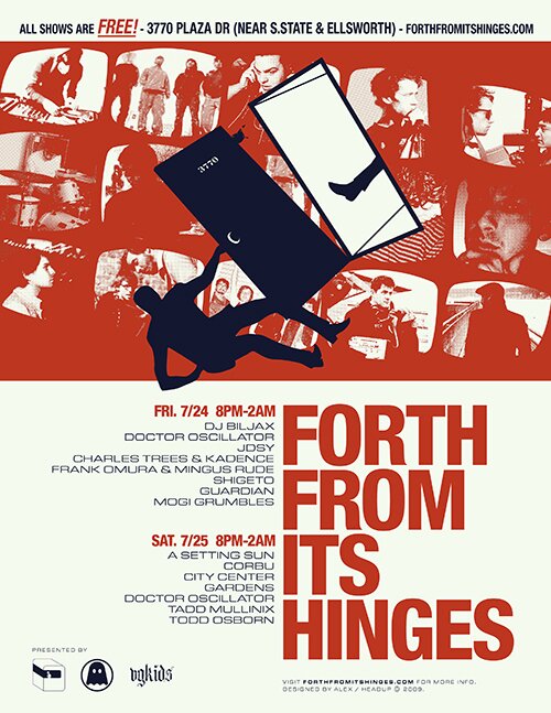
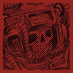
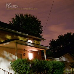
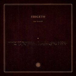
Later this week and weekend, I will be heading out to Ann Arbor, MI with Jakub, and my friends Bryan and Jonathan, who plays in a band called Corbu, for a huge music and art festival called Forth From Its Hinges. The brainchild of A2 natives Steve Hall and brothers Zachary and Ben Saginaw (who you may recognize as Shigeto/Frank Omura and the artist behind Frank Omura’s awesome covers, respecitvely), this will be the festival’s third year, and already, excitement since last year’s installment has begun to build once again. If you’re in the area and you don’t yet know about this, you should definitely check it out! It’s FREE, and we all love free (there will even be food!). Aside from the musical lineup, which brings together a great cross-section of the music emanating from of Ann Arbor, the festival is also geared toward visual and fine artists, with tons of warehouse space for makeshift galleries and installation art. Having never been there, I’ve only heard stories…but perhaps even more telling than the stories themselves is the palpable energy and wistful glee of the storytellers themselves.
I came up with the poster above after Zach asked me if I would like to design something for this year’s FFIH. Playing around with ideas for weeks, I basically had the above concept in my head for a while until it got to crunch time. To give you an idea of just how short the production time for this was– I started the project on Thursday and submitted prints for 11″x17″, 8.5″x11″ and quartered handbills in both color and B&W Saturday afternoon. The concept for a man falling through another dimension came to me almost right off the bat, and I always took the name of the show quite literally, picturing something coming right off its hinges. Clearly the falling man is reminiscent of the film poster for Vertigo, and while I make reference to that shape, it is by no means a direct copy. The other aspect of the poster I felt drawn to from the start was the titling– I wanted to go a with a bold, condensed, gothic font, presented almost if it were some kind of film poster. Zach suggested the idea of including artist photos in the background, and I loved the idea, but thought it would better align with the style forming within this design to put them into old television screens. The final version, while admittedly hastily prepared, has me satisfied that I was able to translate such a clear idea into reality under such a short timeframe. I would have made a couple minor tweaks, but as a whole I am very happy with it, and so are the people behind FFIH.
Again, if you’re around, you should come out and hang, check out some art, peep some live tunes, grub on some food. Events on Facebook for: and .
Posted in Design and Music Posted by Alex on Jul 20 2009 11:45 am
Trackback URL
