Portfolio Printbook Project: Part 1
This might be a project worth sharing, perhaps someone out there looking for help organizing their work would benefit from reading about my experience. Addressing the need for a fresh, new .pdf of my portfolio, and the desire for something in printed form, I spent months mulling over what would be the best way to lay things out. The .pdf has been completed, and now I need to print and bind it. This is still an in-progress project, but as I move to the second phase of getting my portfolio in physical form, I’ll plan to post something on that as well.
Pre-work
The first step for me was to try and visualize a layout for my work that I liked. There was next to nothing that I could find in the way of good inspirational references, which may have been to my ultimate advantage. It should be noted that my printbook is not intended for public consumption, but for specific professional and educational purposes. I think most designers have the same attitude about their printbook, so it’s no wonder I couldn’t easily find much from others. After months of getting little traction, I decided to take another step back and think just about what sort of features I’d like it to have. I wanted the layout to be clean, simple, and classical, while adhering to a grid structure that was strict, but not overly complex. I also knew that I would want to have a final product constructed using InDesign (Id). After getting nowhere fast using Id to try and mock something up, I fell back to Photoshop (Ps), my most comfortable and reliable graphic software.
This brings me to my first piece of advice: your printbook is a reflection of you, not outside influences. Anything you don’t already have in your head as an idea is likely just a waste of time. Step back and try to build a high-level concept from the ground-up by leveraging your own tastes and interests. Most importantly, don’t force the medium or software you use, let sketches be sketched, mockups be mocked up, and layouts be laid out, each in their most natural manner.
Grids
Once I had some semblance of an idea as to the structure I wanted to apply to my portfolio, I went to work creating a grid to accommodate the images and type that would make the printbook up. For non-designers, or casual designers who don’t know much about grids (like me a few years ago), grids are your friend. Proper knowledge of grids can make laying things out incredibly easy, and gives consistent results that look good. It takes time to master, and by no means am I an expert, but I do appreciate and utilize the power of the grid. Using guides and grids in Ps, I laid out a 3×4-square grid on 8.5×11″ paper, with a 0.5″ margin, the main image of each project would take up two columns, leaving one for a stack of smaller images. The grid squares and gutters were pretty arbitrary in measurement, but I knew it wouldn’t be a factor once I got into InDesign, because when setting up the document, a few sizes and settings can have it set up the same way. In fact, in retrospect, it was much easier in InDesign than Photoshop to experiment with grids.
My second tip: grids can be a huge help, but also something of a headache at first. Perseverance is rewarded, a lot of the up-front work involved in laying out your grid before anything else will take a lot of the guesswork out of following steps.

Mockup (Ps)
Now that I had a solid grid structure to help me define what goes where, and at what size, I had to then consider literally what of my work would be included. Of course, I didn’t just get to thinking about it then, but using 20 pages of my best project work as my rule of thumb, I had to narrow down not only what to include, but how to fit it into the grid. This presented my next significant challenge, primarily when it came to print projects– different paper sizes meant that some fit the grid, others were slightly too thin, others too thick. One thing about grids, is that they do not have to be adhered to so religiously as to put quality into question. In fact, from what I’ve learned so far, there are plenty of extra steps and considerations that help to solve problems like this. The answer: don’t worry about it. It’s almost laughable, but as long as I’m keeping the gutter spacing between elements on track, the outer edges of any pieces that didn’t fit the grid, as long as they had nothing else to align to, looked fine.
Next, I could start to think about style and identity, addressing my favorite part of the process. In retrospect, one reason I’m really glad that I went through the project this way– mocking everything up in Photoshop, then using that as a blueprint to guide its layout in InDesign– is that it allowed me to experiment with images and type, but also, more importantly, to have all images I’d need to place within InDesign at the correct sizes and filetypes. While I acknowledge that this approach also takes twice as much time, it was a good way to ensure that I was in control of every aspect. Additionally, Ps would be required at this point anyway, to create graphical assets unique to the layout of the document, which Id’s drawing and shape tools just aren’t meant to handle.
My third tip: it’s important to be pragmatic throughout the mockup phase. Getting hung up on things can really waste a lot valuable time, so remember to step back when you hit a snag, and ask around! In fact, if you don’t already have a reliable source of competent feedback, you should have one…more on that later!
 in Ps, ready to go into Id")
Layout (Id)
I spent a whole lot of time in Ps trying to micromanage every little detail, but this also defined everything I needed to build within Id. I guess it could go either way, it depends on what you would prefer– efficiency or meticulous control, I opted for the latter, but given what I now know, I might go for efficiency moving forward. I should also mention that I needed to spend a couple nights dedicated to beefing up my knowledge of InDesign, some very worthwhile time spent. At any rate, as I said earlier, it’s easy to define a grid within InDesign simply entering the number of columns desired, and the gutter size. At first, I set up a series of master pages to fit the exact layouts (including image placeholders) for each page. As my document progressed and changed, page orders and templates and all, this got more in the way than it helped. For such a relatively small document, I think I’d keep my master pages much simpler next time.
Once I had all my text and images placed, my hyperlinks linked, and was ready to export, the next challenge presented itself. I still don’t know exactly why this was happening, but when I exported the .indd to a High Quality Print .pdf, the even page numbers (which were originally in the master pages) were not being exported, even though they showed up fine throughout the .indd. This was another reason for my simplification of the master pages, but I ended up placing the page numbers on the individual pages (all on the lower right, for the .pdf, it will change for the physical book). Finally, the last little problem had been resolved when the .pdf finally exported correctly.
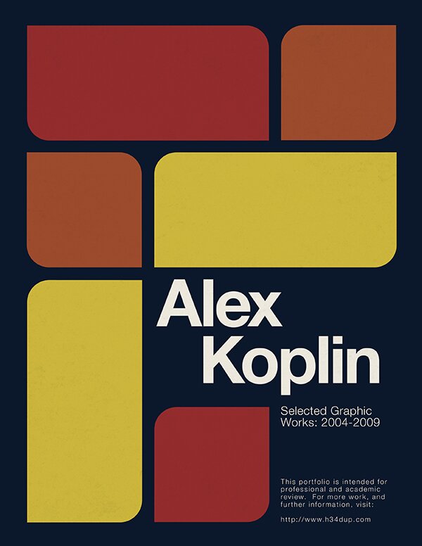
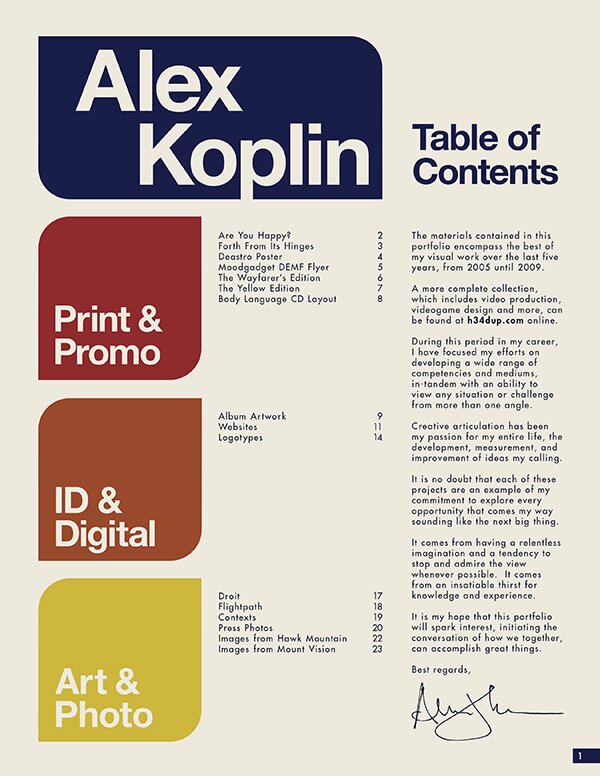
The resulting .pdf is exactly as I originally intended– clean, simple, a hint of classic style, each page defined by a simple grid structure. I hope others will perceive it favorably when I send it out with school and job applications.
My forth tip: InDesign is a remarkably useful tool which those who grew up on Photoshop might not fully appreciate. As with all programs in Adobe Creative Suite, each has their own ideal purpose, and if you know that you aren’t using the right program for the right purpose, it is undoubtedly to your benefit if you take some time (dedicate at least 8 hrs) to learn the ropes, or reinforce what knowledge you might have. Again, it’s a time consideration, but it’s also a knowledge investment that will pay off in the future.

Other Considerations
Here are a few other important things to consider:
As mentioned before, you don’t have to be operating in a vacuum, even if the idea is to draw everything from within. It’s a good idea to ask a trusted friend or colleague or mentor, preferably someone who knows a thing or two about printbooks or design, for feedback and guidance. I was lucky to enlist the assistance of my friend Shelby White, who has been my go-to guy for help and feedback for a range of design projects. Your sources of feedback should be there to help answer questions and solve problems, and to tell you when something doesn’t work or fit. If all you’re hearing is “oh, that looks pretty cool dude,” then you need to either ask for elaboration or find someone else who knows more.
File sizes and formats are important to consider. I’m actually still in the consideration phase here, as I want to size down to .pdf without losing too much image quality. My high-quality print comes out to 28mb, which is rather hefty. A separate file size concern arises when you consider the weight of a full-sized .psd mockup (nearly a gig), and that of all the full-size .tiff files exported from it for placement in Id, be prepared for memory and RAM to come into play, depending on your computer. I will want to back these files up on physical and external HD as soon as they are ready.
In Conclusion
I hope this will help shed some light into this process, if anyone out there has been looking for help putting together a printable, presentable, professional portfolio. There are things I know I did right, things I know I could improve upon in the future, and things I learned along the way. Even still, I hope this opens up some conversation about your approach to conveying your own work, whatever form it takes. How do you do it? What would you do differently?
3 Responses to “Portfolio Printbook Project: Part 1”
Trackback URL


on 04 Nov 2009 at 2:31 pm # Brian
Nicely done. I’m always interested to read about the process that goes into this sort of thing, and your results look great.
on 04 Nov 2009 at 4:43 pm # Shelby
I love a good process post. Glad to see that you’re done with this and other people can enjoy its beauty.
on 04 Nov 2009 at 7:19 pm # A_Flama
Really nice stuff
Good luck!!!