Re-designing the New York City Subway Map
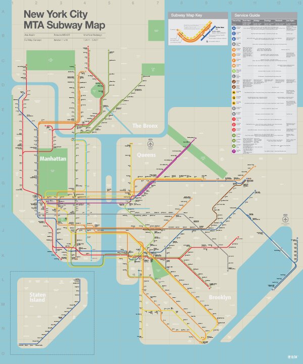
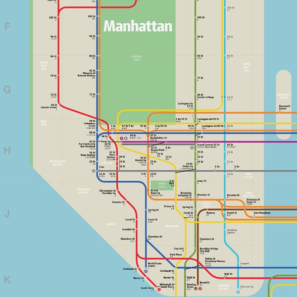
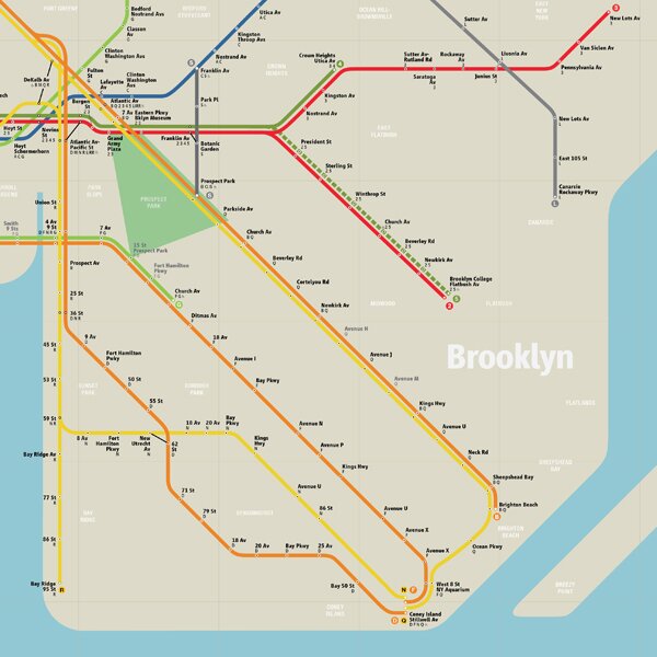
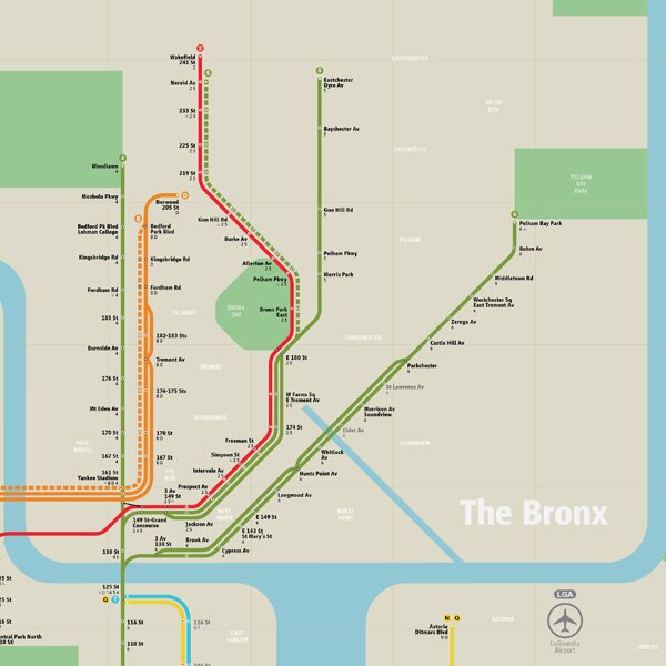
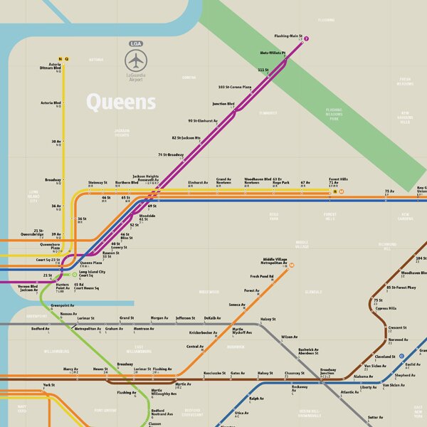
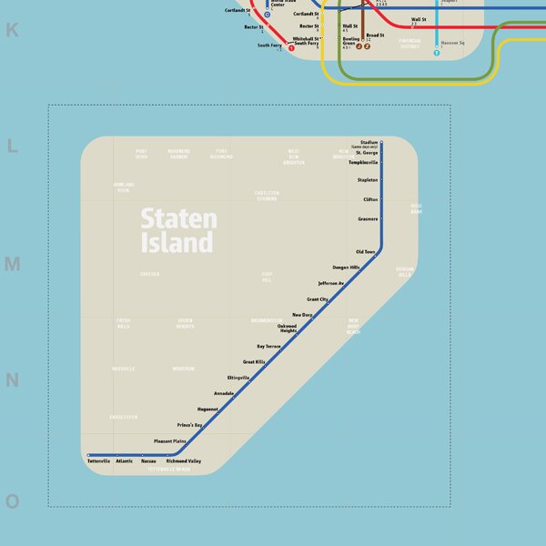
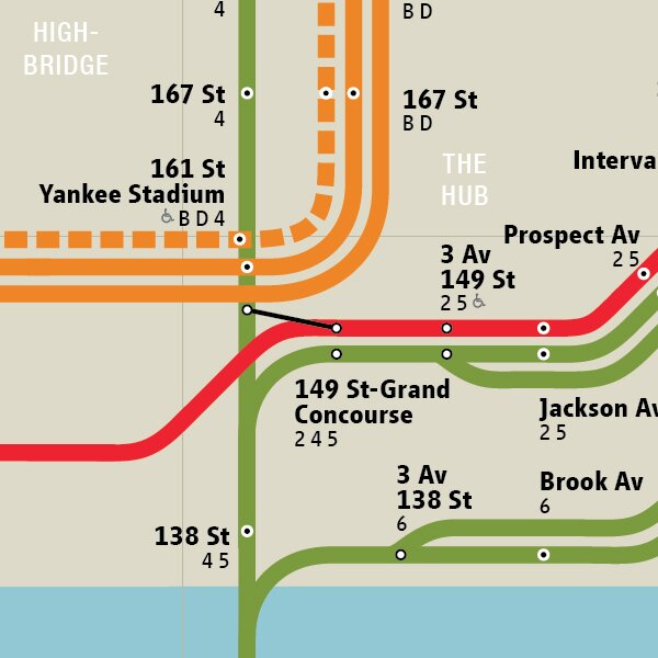
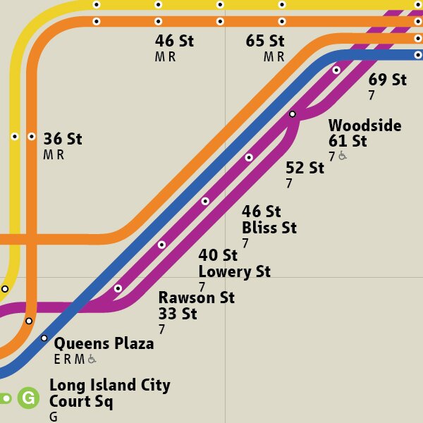
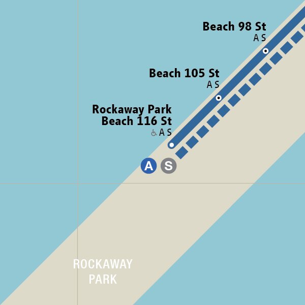
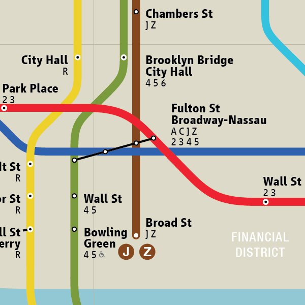
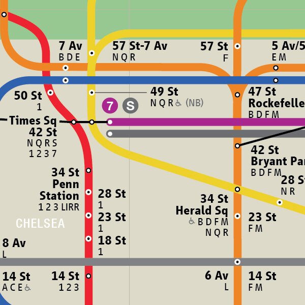
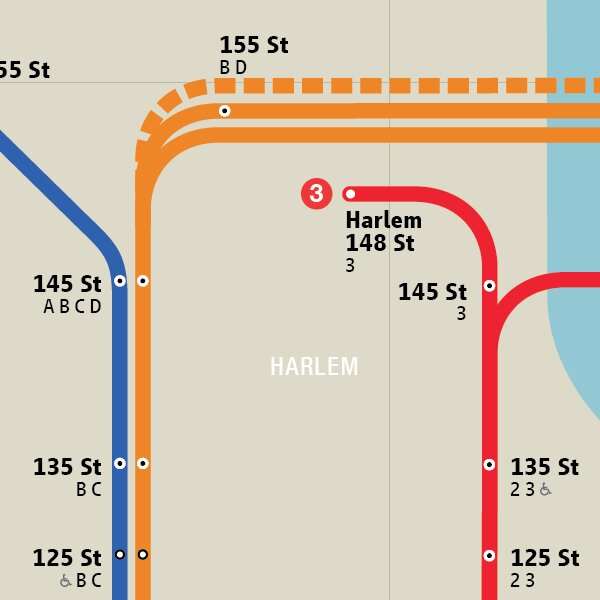
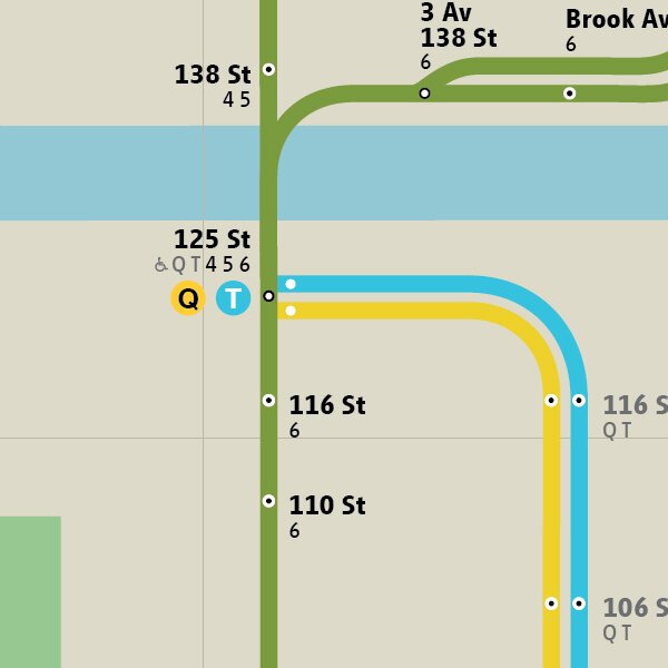
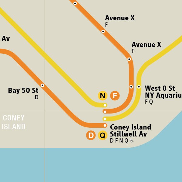
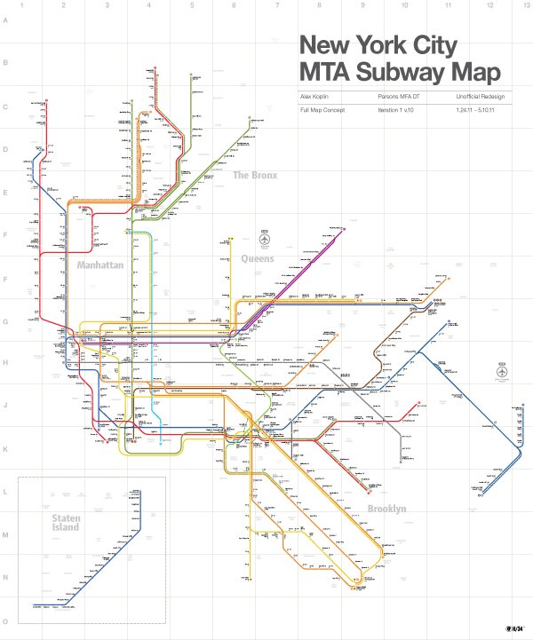
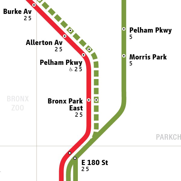
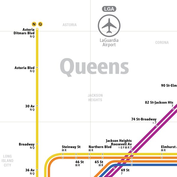
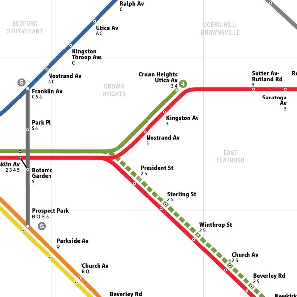
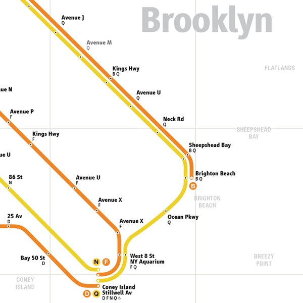
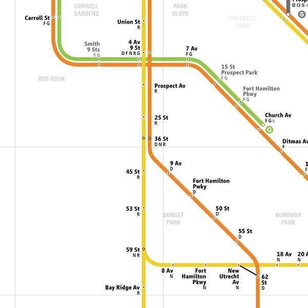
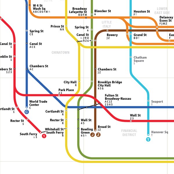
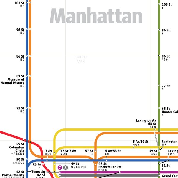
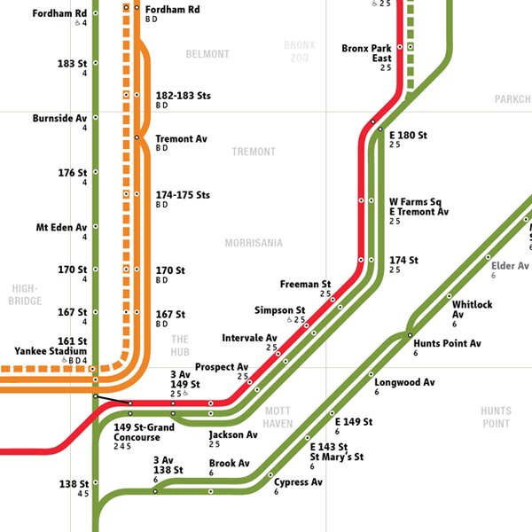
This is the lastest iteration of my take on a map of the New York City MTA subway system, which I consider to be a rough study. The project started as a co-lab course at Parsons, taught by Julia Wargaski and Paul Shaw (author of Helvetica and the New York Subway System). As part of our deep and intense study of the map’s various incarnations over the last century, and work on individual map re-design concepts, we were graced with the insights of numerous guest speakers and critics. Among these guests was Massimo Vignelli, whose 1972 subway map served as the primary precedence for my own re-design. In this iteration of my subway map re-design, my aim is to reach a common ground between the aesthetic integrity of the Vignelli map and the user-friendliness of the Hertz-inspired version in-use today.
This is most certainly an on-going pursuit for me, as even now after nearly a year of the most intense study of my life, much of it in the mapping and data viz space, I look at the map above and think about how I could improve it further. In fact, it almost makes me want to re-design the map all over again. From signage, to kiosks, wearables, to metro passes, I have ideas about how all the entire subway system could be improved through solid design. Let’s hope one day I’ll be able to flesh those ideas out one way or another.
Typographically, in this iteration of the map, I’m using Linotype’s Vialog, which was granted a limited license by the foundry, along with Neue Helvetica. Color-wise, I spent a lot of time with the color scheme, including a months-long period of observing without editing, and finally (literally, today) decided in about 60 seconds what I wanted to go with. I have also made public a lines-only version of the map, to illustrate the possibilities and hint at ideas.
2 Responses to “Re-designing the New York City Subway Map”
Trackback URL


on 01 Jan 2012 at 4:56 pm # Matthew Gallagher
I’ve always thought subway maps looked like colorful motherboards. Always interested in the beauty of getting things from one to place to another.
on 22 Feb 2012 at 1:56 pm # Joel
Hello there! I am a teacher here in Manhattan and the kids and I are working on a project about the NYC subway system. I was hoping to get a high-quality version of this map:
It perfect for our needs, and I can’t find anything else like it online! If you can possibly send it (in any format) to joel ]at[ cgps ]dot[ org, I would be very grateful!
~Joel